The goal of mpactr is to correct for errors that occur during the pre-processing of raw tandem MS/MS data. This data needs to be filtered prior to downstream analyses because of limitations in mass spectrometry detection capabilities. Once filtering is complete, you should have a feature table containing high quality MS1 features. This table can be used for a variety of analyses that can be conducted in R to better understand if and how samples differ from one another.
In this article, we will highlight just a few analyses. This is not an exhaustive list, and there are certainly other ways to conduct the analyses shown below - the beauty of R! We will walk you through how to do the following:
- creating an interactive plot of input features and the filters they
failed, if any, using
ggplotandplotly - correlating sample profiles at multiple levels (sample, technical
replicates, and biological replicates) using
Hmiscandcorrplot - visualizing sample clustering as a dendrogram with
ggdendro - differential abundance analysis:
- calculating fold change between two biological groups
- visualizing fold change, m/z, and retention time as a 3D scatter plot
- conducting t-tests for fold change differences, calculating p-values, and calculating q-values for false discovery rate (FDR) correction
- visualizing significant fold change differences in a volcano plot
Load required libraries
We will be using multiple libraries for data analysis and
visualization, which can be loaded below. If you do not have some or all
of the packages listed, you can install them with
install.packages("packagename").
Filter MS1 feature table with mpactr
data <- import_data(example("cultures_peak_table.csv"),
  example("cultures_metadata.csv"),
  format = "Progenesis"
)
We will be using example data in the mpactr package,
which has 24 samples and 8 biological groups. Biological groups are:
JC1, Media, JC28, ANGDT, ANG18, Coculture, Mixed_Monoculture,
Solvent_Blank.
We will check our feature table for mispicked ions, remove solvent blank and media blanks features with a relative ion abundance > 0.01, relative to other groups, and check ions for replicability.
data_filtered <- data |>
  filter_mispicked_ions(merge_peaks = TRUE, merge_method = "sum") |>
  filter_group(group_to_remove = "Solvent_Blank") |>
  filter_group(group_to_remove = "Media") |>
  filter_cv(cv_threshold = 0.2, cv_param = "median")
#> ℹ Checking 1334 peaks for mispicked peaks.
#> ℹ Argument merge_peaks is: TRUE. Merging mispicked peaks with method sum.
#> ✔ 73 ions failed the mispicked filter, 1261 ions remain.
#> ℹ Parsing 1261 peaks based on the sample group: Solvent_Blank.
#> ℹ Argument remove_ions is: TRUE.Removing peaks from Solvent_Blank.
#> ✔ 25 ions failed the Solvent_Blank filter, 1236 ions remain.
#> ℹ Parsing 1236 peaks based on the sample group: Media.
#> ℹ Argument remove_ions is: TRUE.Removing peaks from Media.
#> ✔ 751 ions failed the Media filter, 485 ions remain.
#> ℹ Parsing 485 peaks for replicability across technical replicates.
#> ✔ 62 ions failed the cv_filter filter, 423 ions remain.
Overall, 423 ions remain in the feature table. A summary of the filtering, as a tree map is below:
plot_qc_tree(data_filtered)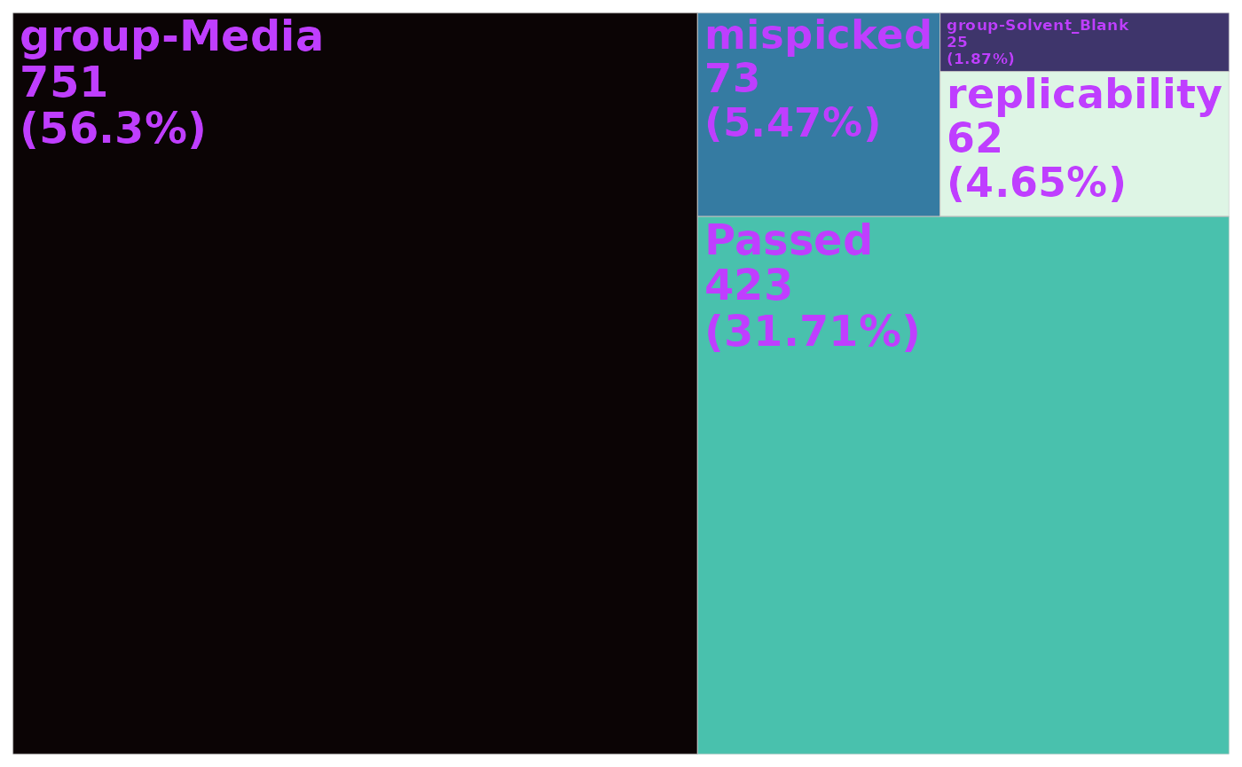
Interactive scatter plot of all input ions and their fate during filtering
Visualizing each compound by m/z and retention time, and their fate
during filtering may be useful to see if filters are removing features
at certain retention time or m/z ranges. To create this plot, we first
need to extract the raw data table, which has all pre-filtered ions
(including m/z and retention time). We can do this with the mpactr
function get_raw_data(), and then select the Compound, mz,
and rt columns.
get_raw_data(data_filtered) %>%
  select(Compound, mz, rt) %>%
  head()
#>    Compound       mz        rt
#>       <num>    <num>     <num>
#> 1:        1 256.0883 0.7748333
#> 2:        2 484.2921 0.7756667
#> 3:        3 445.2276 0.7786667
#> 4:        4 354.1842 0.7786667
#> 5:        5 353.1995 0.7816667
#> 6:        6 448.2945 0.7846667
Next, we need to extract the ion status with mpactr
function qc_summary(). This function returns a
data.table reporting the ion status for each input ion.
This includes which filter each ion failed or passed, or if the ion
passed all applied filters.
qc_summary(data_filtered) %>%
  head()
#>    status compounds
#>    <char>    <char>
#> 1: Passed      1000
#> 2: Passed      1001
#> 3: Passed      1002
#> 4: Passed      1003
#> 5: Passed      1004
#> 6: Passed      1005
We can join these two data.tables for plotting data
set:
get_raw_data(data_filtered) %>%
  mutate(Compound = as.character(Compound)) %>%
  select(Compound, mz, rt) %>%
  left_join(qc_summary(data_filtered),
    by = join_by("Compound" == "compounds")
  ) %>%
  head()
#>    Compound       mz        rt      status
#>      <char>    <num>     <num>      <char>
#> 1:        1 256.0883 0.7748333 group-Media
#> 2:        2 484.2921 0.7756667 group-Media
#> 3:        3 445.2276 0.7786667 group-Media
#> 4:        4 354.1842 0.7786667 group-Media
#> 5:        5 353.1995 0.7816667 group-Media
#> 6:        6 448.2945 0.7846667 group-Media
Now we can create a scatter plot to show the input features (m/z ~
retention time) and their fate (status) using ggolot and
geom_point.
get_raw_data(data_filtered) %>%
  mutate(Compound = as.character(Compound)) %>%
  select(Compound, mz, rt) %>%
  left_join(qc_summary(data_filtered),
    by = join_by("Compound" == "compounds")
  ) %>%
  ggplot() +
  aes(x = rt, y = mz, color = status) +
  geom_point() +
  viridis::scale_color_viridis(discrete = TRUE) +
  labs(
    x = "Retention time (min)",
    y = "m/z",
    color = "Ion Status"
  ) +
  theme_bw() +
  theme(legend.position = "top")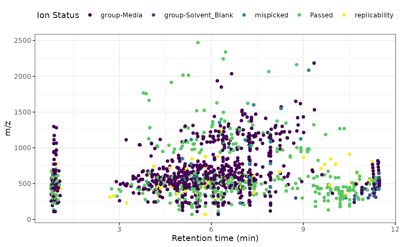
We can also make the plot interactive with the plotly
package function ggplotly.
feature_plot <- get_raw_data(data_filtered) %>%
  mutate(Compound = as.character(Compound)) %>%
  select(Compound, mz, rt) %>%
  left_join(qc_summary(data_filtered),
    by = join_by("Compound" == "compounds")
  ) %>%
  ggplot() +
  aes(
    x = rt, y = mz, color = status,
    text = paste0("Compound: ", Compound)
  ) +
  geom_point() +
  viridis::scale_color_viridis(discrete = TRUE) +
  labs(
    x = "Retention time (min)",
    y = "m/z",
    color = "Ion Status"
  ) +
  theme_bw() +
  theme(legend.position = "top")

ggplotly(feature_plot)
Correlation between samples at different levels
We may be interested in how individual samples, or biological groups
correlate to each other. For this analysis, we will need to extract the
filtered feature table with mpactr function
get_peak_table(). This function will return the filtered
data.table where rows are features and columns are either
compound metadata or intensity values for samples.
ft <- get_peak_table(data_filtered)

ft[1:5, 1:7]
#> Key: <Compound, mz, kmd, rt>
#>    Compound       mz     kmd       rt 102423_Blank_77_1_5095
#>      <char>    <num>   <num>    <num>                  <num>
#> 1:     1000 278.0638 0.06382 5.522833                      0
#> 2:     1001 296.0736 0.07365 5.524667                      0
#> 3:     1002 222.0751 0.07512 5.523333                      0
#> 4:     1003 210.0771 0.07706 5.521500                      0
#> 5:     1004 614.1282 0.12818 5.526167                      0
#>    102423_Blank_77_2_5096 102423_Blank_77_3_5097
#>                     <num>                  <num>
#> 1:                      0                      0
#> 2:                      0                      0
#> 3:                      0                      0
#> 4:                      0                      0
#> 5:                      0                      0
Correlation between each individual sample
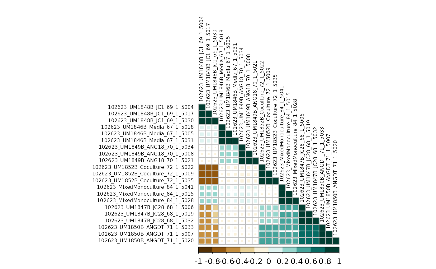
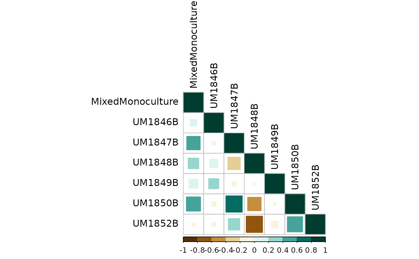
First, we can look at the correlation between each individual sample, regardless of technical replicates and biological groups. This will show how well technical and biological replicates correlate, where we are expecting to see near perfect correlation replicates.
We will use Hmisc::rcorr() to perform spearman
correlations. This function is expecting a matrix where
columns are samples to correlate and rows are features. Since the
feature table has columns for both feature metadata and samples, we need
to remove feature metadata for rcorr(). We can do this by
extracting sample names from the metadata Injection column,
which match sample column names in the feature table. We also need to
remove any samples that no longer have any features post-filtering
(likely solvent blanks).
counts <- ft %>%
  select(Compound, all_of(get_meta_data(data_filtered)$Injection)) %>%
  column_to_rownames(var = "Compound") %>%
  select(where(~ sum(.x) != 0))

counts[1:5, 1:2]
#>      102623_UM1848B_JC1_69_1_5004 102623_UM1846B_Media_67_1_5005
#> 1000                            0                              0
#> 1001                            0                              0
#> 1002                            0                              0
#> 1003                            0                              0
#> 1004                            0                              0
Next we can run the correlation:
The counts_cor object is a list of data for the
correlations. The correlation coefficients are stored in the
r slot, and p-values in the p slot. We can see
the correlations for first sample below
counts_cor$r[, 1]
#>       102623_UM1848B_JC1_69_1_5004     102623_UM1846B_Media_67_1_5005
#>                         1.00000000                         0.17541589
#>      102623_UM1847B_JC28_68_1_5006     102623_UM1850B_ANGDT_71_1_5007
#>                        -0.40190441                        -0.46544728
#>     102623_UM1849B_ANG18_70_1_5008 102623_UM1852B_Coculture_72_1_5009
#>                        -0.03971590                        -0.66162852
#>  102623_MixedMonoculture_84_1_5015       102623_UM1848B_JC1_69_1_5017
#>                         0.26791815                         0.98020218
#>     102623_UM1846B_Media_67_1_5018      102623_UM1847B_JC28_68_1_5019
#>                         0.17402775                        -0.40305906
#>     102623_UM1850B_ANGDT_71_1_5020     102623_UM1849B_ANG18_70_1_5021
#>                        -0.46660263                        -0.03989960
#> 102623_UM1852B_Coculture_72_1_5022  102623_MixedMonoculture_84_1_5028
#>                        -0.65976408                         0.26407704
#>       102623_UM1848B_JC1_69_1_5030     102623_UM1846B_Media_67_1_5031
#>                         0.97770847                         0.17541193
#>      102623_UM1847B_JC28_68_1_5032     102623_UM1850B_ANGDT_71_1_5033
#>                        -0.40190659                        -0.46138695
#>     102623_UM1849B_ANG18_70_1_5034 102623_UM1852B_Coculture_72_1_5035
#>                        -0.01196953                        -0.66541048
#>  102623_MixedMonoculture_84_1_5041
#>                         0.25869973
Finally, we can plot the correlations map with corrplot.
Style options can be customized to your liking (see corrplot).
corrplot(counts_cor$r,
  type = "lower",
  method = "square",
  order = "hclust",
  col = COL2("BrBG", 10),
  tl.col = "black",
  tl.cex = .5
)
Correlation between technical replicates
Next, we can look at the correlation between technical replicates to see how they compare across the dataset. For this, we will calculate the average intensity for each compound across technical replicates and run a correlation in the same manner shown above.
In the original counts table, we set the row names from
the column Compound, which holds the compound id. Here we
need to reset our Compound column and pivot the data table
for calculating averages.
meta <- get_meta_data(data_filtered)

counts %>%
  rownames_to_column(var = "Compound") %>%
  pivot_longer(
    cols = starts_with("102623"),
    names_to = "Injection",
    values_to = "Intensity"
  ) %>%
  head()
#> # A tibble: 6 × 3
#>   Compound Injection                          Intensity
#>   <chr>    <chr>                                  <dbl>
#> 1 1000     102623_UM1848B_JC1_69_1_5004              0
#> 2 1000     102623_UM1846B_Media_67_1_5005            0
#> 3 1000     102623_UM1847B_JC28_68_1_5006        183612.
#> 4 1000     102623_UM1850B_ANGDT_71_1_5007         3680.
#> 5 1000     102623_UM1849B_ANG18_70_1_5008            0
#> 6 1000     102623_UM1852B_Coculture_72_1_5009        0
Next, we will join with sample meta data so we can calcuate averages
by Sample_Code.
counts %>%
  rownames_to_column(var = "Compound") %>%
  pivot_longer(
    cols = starts_with("102623"),
    names_to = "Injection",
    values_to = "Intensity"
  ) %>%
  left_join(meta, by = "Injection") %>%
  head()
#> # A tibble: 6 × 6
#>   Compound Injection             Intensity Sample_Code Biological_Group dilution
#>   <chr>    <chr>                     <dbl> <chr>       <chr>               <dbl>
#> 1 1000     102623_UM1848B_JC1_6…        0  UM1848B     JC1                     1
#> 2 1000     102623_UM1846B_Media…        0  UM1846B     Media                   1
#> 3 1000     102623_UM1847B_JC28_…   183612. UM1847B     JC28                    1
#> 4 1000     102623_UM1850B_ANGDT…     3680. UM1850B     ANGDT                   1
#> 5 1000     102623_UM1849B_ANG18…        0  UM1849B     ANG18                   1
#> 6 1000     102623_UM1852B_Cocul…        0  UM1852B     Coculture               1
Now we can calculate mean intensity for each Compound
and Sample_Code.
counts %>%
  rownames_to_column(var = "Compound") %>%
  pivot_longer(
    cols = starts_with("102623"),
    names_to = "Injection",
    values_to = "Intensity"
  ) %>%
  left_join(meta, by = "Injection") %>%
  summarise(
    mean_intensity = mean(Intensity),
    .by = c(Compound, Sample_Code)
  ) %>%
  head()
#> # A tibble: 6 × 3
#>   Compound Sample_Code mean_intensity
#>   <chr>    <chr>                <dbl>
#> 1 1000     UM1848B                 0
#> 2 1000     UM1846B                 0
#> 3 1000     UM1847B            182682.
#> 4 1000     UM1850B              3762.
#> 5 1000     UM1849B                 0
#> 6 1000     UM1852B                 0
Finally, we need to reformat the table so columns are sample codes for the correlation.
sample_counts <- counts %>%
  rownames_to_column(var = "Compound") %>%
  pivot_longer(
    cols = starts_with("102623"),
    names_to = "Injection",
    values_to = "Intensity"
  ) %>%
  left_join(meta, by = "Injection") %>%
  summarise(
    mean_intensity = mean(Intensity),
    .by = c(Compound, Sample_Code)
  ) %>%
  pivot_wider(
    names_from = Sample_Code,
    values_from = mean_intensity
  ) %>%
  column_to_rownames(var = "Compound")

sample_counts[1:5, 1:5]
#>      UM1848B UM1846B   UM1847B  UM1850B UM1849B
#> 1000       0       0 182681.78 3762.133       0
#> 1001       0       0  69643.45 6540.170       0
#> 1002       0       0  25588.00 3730.070       0
#> 1003       0       0  10424.57    0.000       0
#> 1004       0       0  23216.59 1724.140       0
Run the correlation:
And finally visualize:
corrplot(sample_counts_cor$r,
  type = "lower",
  method = "square",
  order = "alphabet",
  col = COL2("BrBG", 10),
  tl.col = "black"
)
Correlation between biological replicates
We can also look at the correlation between biological groups. In
this dataset, technical replicates and biological groups are the same;
however if you have multiple technical replicates you may also be
interested in the correlation between biological groups. We will
calculate mean intensity values for Biological_Group in the
same manner as we did for Sample_Code.
group_counts <- counts %>%
  rownames_to_column(var = "Compound") %>%
  pivot_longer(
    cols = starts_with("102623"),
    names_to = "Injection",
    values_to = "Intensity"
  ) %>%
  left_join(meta, by = "Injection") %>%
  summarise(
    mean_intensity = mean(Intensity),
    .by = c(Compound, Biological_Group)
  ) %>%
  pivot_wider(
    names_from = Biological_Group,
    values_from = mean_intensity
  ) %>%
  column_to_rownames(var = "Compound")
Run the correlation analysis with rcorr():
Visualize correlation:
corrplot(group_counts_cor$r,
  type = "lower",
  method = "square",
  order = "alphabet",
  col = COL2("BrBG", 10),
  tl.col = "black"
)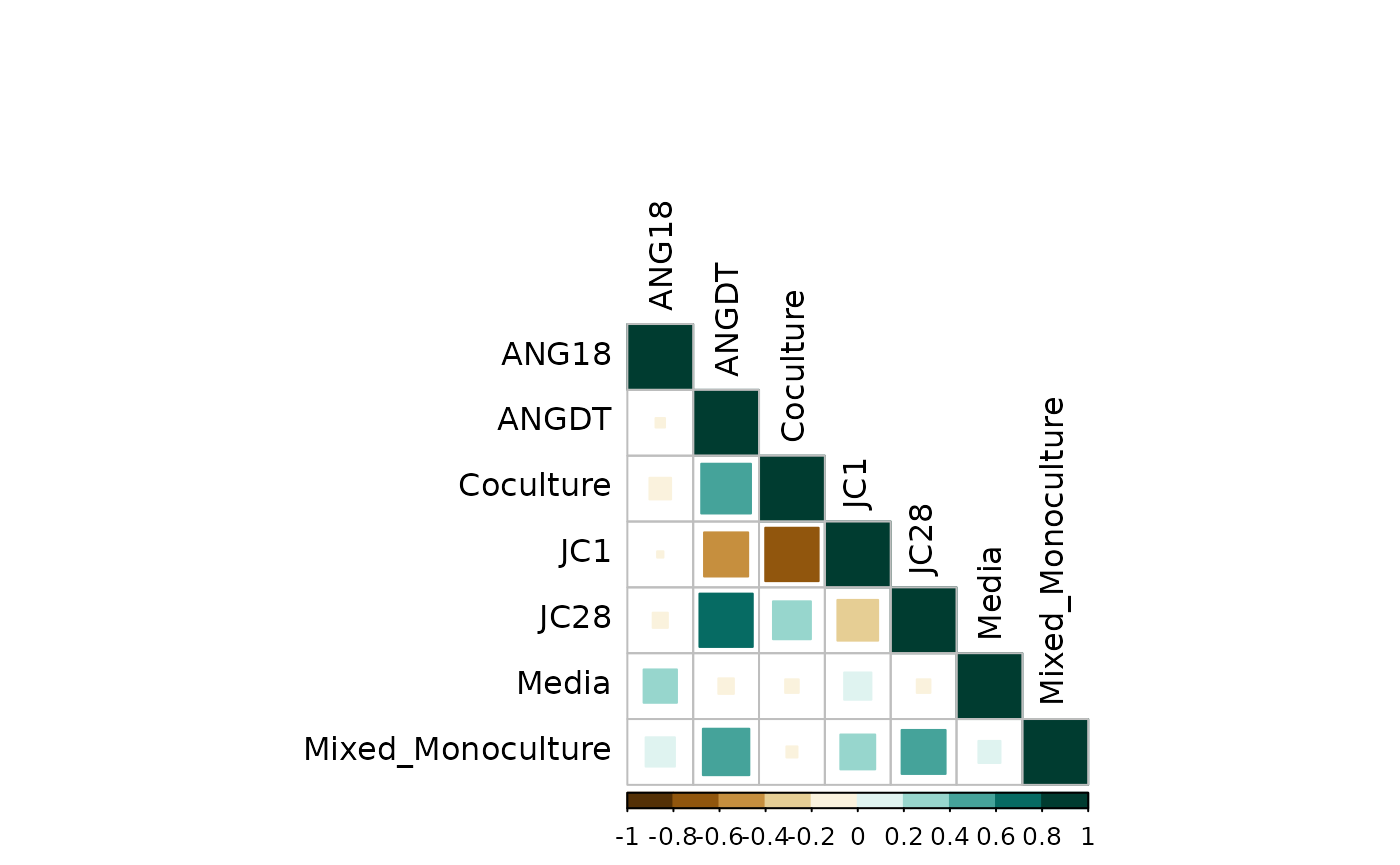
As expected, the biological group correlation matrix matches the technical replicates correlation.
Dendrogram
You may be interested in visualizing how similar samples are with a
dendrogram. For this we will need to calculate the distance between
samples with stats::dist(), cluster with
hclust(), and visualize with ggplot and
ggdendro packages.
First, calculate distance and cluster:
dist <- stats::dist(t(counts), method = "euclidian")
cluster <- stats::hclust(dist, method = "complete")
Calculate dendrogram components with
stats::as.dendrogram():
dendro <- as.dendrogram(cluster)Extract plotting elements with
ggdendrogram::dendro_data()
den_data <- dendro_data(dendro, type = "rectangle")Use ggplot and ggdendrogram to plot the
dendrogram. For more customizations, see ggdendro
documentation.
ggplot(segment(den_data)) +
  geom_segment(aes(x = x, y = y, xend = xend, yend = yend)) +
  geom_text(
    data = den_data$labels,
    aes(x = x, y = y, label = label),
    size = 3,
    hjust = "outward"
  ) +
  coord_cartesian(ylim = c((min(segment(den_data)$y) + 10),
                           (max(segment(den_data)$y)))) +
  coord_flip() +
  scale_y_reverse(expand = c(.5, 0)) +
  theme_dendro()
#> Coordinate system already present. Adding new coordinate system, which will
#> replace the existing one.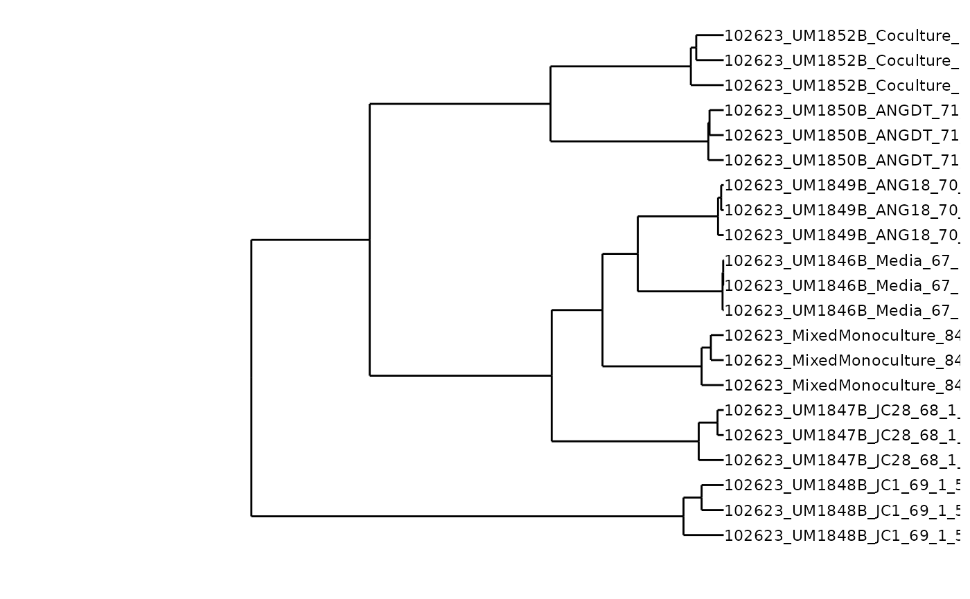
Fold change analysis
Say we wanted to compare metabolite profiles between our Coculture
and ANG18 groups. We can extract group means from the filtered compounds
using the mpactr function get_group_averages(), isolate the
groups of interest, here Coculture and ANG18 monocoluture, and calculate
compound fold change.
Calculate fold change
get_group_averages(data_filtered) %>%
  filter(Biological_Group == "Coculture" |
           Biological_Group == "ANG18") %>%
  select(Compound, Biological_Group, average) %>%
  pivot_wider(names_from = Biological_Group, values_from = average) %>%
  mutate(fc = Coculture / ANG18) %>%
  head()
#> # A tibble: 6 × 4
#>   Compound ANG18 Coculture    fc
#>   <chr>    <dbl>     <dbl> <dbl>
#> 1 1000         0         0   NaN
#> 2 1001         0         0   NaN
#> 3 1002         0         0   NaN
#> 4 1003         0         0   NaN
#> 5 1004         0         0   NaN
#> 6 1005         0         0   NaN
Inherently, tandem MS/MS datasets can be filled with many zeros. In some instances a compound is found in the experimental group but not in the control group, or vice versa. In these cases, the fold change calculation yields an infinite number as there is a zero either in the numerator or denominator (). There is also the chance that the compound is not found in either group, yielding a fold change on NaN (0/0).
Compounds that are not in either group are of no interest in this comparison and can therefore be removed from the analysis.
get_group_averages(data_filtered) %>%
  filter(Biological_Group == "Coculture" |
           Biological_Group == "ANG18") %>%
  select(Compound, Biological_Group, average) %>%
  pivot_wider(names_from = Biological_Group, values_from = average) %>%
  mutate(nonzero_compound = if_else(Coculture == 0 & ANG18 == 0,
                                    FALSE,
                                    TRUE)) %>%
  filter(nonzero_compound == TRUE) %>%
  mutate(fc = Coculture / ANG18) %>%
  head()
#> # A tibble: 6 × 5
#>   Compound ANG18 Coculture nonzero_compound    fc
#>   <chr>    <dbl>     <dbl> <lgl>            <dbl>
#> 1 1007        0      8929. TRUE               Inf
#> 2 1024        0     11317. TRUE               Inf
#> 3 103         0      5152. TRUE               Inf
#> 4 1039     1145.        0  TRUE                 0
#> 5 1040      669.        0  TRUE                 0
#> 6 105         0     16501. TRUE               Inf
There are multiple ways to handle compounds that are found in the one group but not the other. Here we will create pseudo-counts by adding a small number (0.001) to all counts prior to calculating fold change. This will alleviate division by 0.
First, extract group averages from the mpactr object and
select the two groups of interest. Here we are interested in the columns
Coculture and ANG18:
get_group_averages(data_filtered) %>%
  filter(Biological_Group == "Coculture" |
           Biological_Group == "ANG18") %>%
  select(Compound, Biological_Group, average) %>%
  head()
#>    Compound Biological_Group average
#>      <char>           <char>   <num>
#> 1:     1000            ANG18       0
#> 2:     1000        Coculture       0
#> 3:     1001            ANG18       0
#> 4:     1001        Coculture       0
#> 5:     1002            ANG18       0
#> 6:     1002        Coculture       0
To calculate fold change, we need to have two columns: one for the control group, here ANG18, and one for the experimental group, Coculture:
get_group_averages(data_filtered) %>%
  filter(Biological_Group == "Coculture" |
           Biological_Group == "ANG18") %>%
  select(Compound, Biological_Group, average) %>%
  head()
#>    Compound Biological_Group average
#>      <char>           <char>   <num>
#> 1:     1000            ANG18       0
#> 2:     1000        Coculture       0
#> 3:     1001            ANG18       0
#> 4:     1001        Coculture       0
#> 5:     1002            ANG18       0
#> 6:     1002        Coculture       0
Now we create pseudo-counts by adding 0.001 to the counts column:
get_group_averages(data_filtered) %>%
  filter(Biological_Group == "Coculture" |
           Biological_Group == "ANG18") %>%
  select(Compound, Biological_Group, average) %>%
  mutate(average = average + 0.001) %>%
  pivot_wider(names_from = Biological_Group, values_from = average) %>%
  head()
#> # A tibble: 6 × 3
#>   Compound ANG18 Coculture
#>   <chr>    <dbl>     <dbl>
#> 1 1000     0.001     0.001
#> 2 1001     0.001     0.001
#> 3 1002     0.001     0.001
#> 4 1003     0.001     0.001
#> 5 1004     0.001     0.001
#> 6 1005     0.001     0.001
Now we can remove compounds with an intensity of 0 in both groups. This equates to a pseuo-count of 0.001:
get_group_averages(data_filtered) %>%
  filter(Biological_Group == "Coculture" |
           Biological_Group == "ANG18") %>%
  select(Compound, Biological_Group, average) %>%
  mutate(average = average + 0.001) %>%
  pivot_wider(names_from = Biological_Group, values_from = average) %>%
  mutate(nonzero_compound = if_else(Coculture == 0.001 & ANG18 == 0.001,
                                    FALSE,
                                    TRUE)) %>%
  filter(nonzero_compound == TRUE) %>%
  head()
#> # A tibble: 6 × 4
#>   Compound    ANG18 Coculture nonzero_compound
#>   <chr>       <dbl>     <dbl> <lgl>
#> 1 1007        0.001  8929.    TRUE
#> 2 1024        0.001 11317.    TRUE
#> 3 103         0.001  5152.    TRUE
#> 4 1039     1145.        0.001 TRUE
#> 5 1040      669.        0.001 TRUE
#> 6 105         0.001 16501.    TRUE
Next, we calculate fold change for all remaining compounds:
get_group_averages(data_filtered) %>%
  filter(Biological_Group == "Coculture" |
           Biological_Group == "ANG18") %>%
  select(Compound, Biological_Group, average) %>%
  mutate(average = average + 0.001) %>%
  pivot_wider(names_from = Biological_Group, values_from = average) %>%
  mutate(nonzero_compound = if_else(Coculture == 0.001 & ANG18 == 0.001,
                                    FALSE,
                                    TRUE)) %>%
  filter(nonzero_compound == TRUE) %>%
  mutate(fc = Coculture / ANG18) %>%
  head()
#> # A tibble: 6 × 5
#>   Compound    ANG18 Coculture nonzero_compound      fc
#>   <chr>       <dbl>     <dbl> <lgl>              <dbl>
#> 1 1007        0.001  8929.    TRUE             8.93e+6
#> 2 1024        0.001 11317.    TRUE             1.13e+7
#> 3 103         0.001  5152.    TRUE             5.15e+6
#> 4 1039     1145.        0.001 TRUE             8.73e-7
#> 5 1040      669.        0.001 TRUE             1.49e-6
#> 6 105         0.001 16501.    TRUE             1.65e+7
Finally, transform fold change to log2:
foldchanges <- get_group_averages(data_filtered) %>%
  filter(Biological_Group == "Coculture" |
           Biological_Group == "ANG18") %>%
  select(Compound, Biological_Group, average) %>%
  mutate(average = average + 0.001) %>%
  pivot_wider(names_from = Biological_Group, values_from = average) %>%
  mutate(nonzero_compound = if_else(Coculture == 0.001 & ANG18 == 0.001,
                                    FALSE,
                                    TRUE)) %>%
  filter(nonzero_compound == TRUE) %>%
  mutate(fc = Coculture / ANG18,
         logfc = log2(fc))

head(foldchanges)
#> # A tibble: 6 × 6
#>   Compound    ANG18 Coculture nonzero_compound      fc logfc
#>   <chr>       <dbl>     <dbl> <lgl>              <dbl> <dbl>
#> 1 1007        0.001  8929.    TRUE             8.93e+6  23.1
#> 2 1024        0.001 11317.    TRUE             1.13e+7  23.4
#> 3 103         0.001  5152.    TRUE             5.15e+6  22.3
#> 4 1039     1145.        0.001 TRUE             8.73e-7 -20.1
#> 5 1040      669.        0.001 TRUE             1.49e-6 -19.4
#> 6 105         0.001 16501.    TRUE             1.65e+7  24.0
Visualize fold change for compounds in a 3D scatter plot
We can then probe compounds by plotting a 3D scatter plot of log2 fold changes as a function of m/z and retention time:
fc_plotting <- foldchanges %>%
  left_join(select(ft, Compound, mz, rt), by = "Compound")

plot_ly(fc_plotting,
  x = ~logfc, y = ~rt, z = ~mz,
  marker = list(color = ~logfc, showscale = TRUE)
) %>%
  add_markers() %>%
  layout(
    scene = list(
      xaxis = list(title = "log2 Fold Change"),
      yaxis = list(title = "Retention Time (min)"),
      zaxis = list(title = "m/z")
    ),
    annotations = list(
      x = 1.13,
      y = 1.05,
      text = "log2 Fold Change",
      xref = "paper",
      yref = "paper",
      showarrow = FALSE
    )
  )
Test for compounds with significant fold changes
For the t-tests, we have already calculated variation for compounds
within biological groups as well as within technical replicates in
biological groups. We can calculate the t statistic and degrees of
freedom and use the t distribution (pt()) to calculate the
p-value.
combine biological and technical variation and calculate sample size
# Satterwaite
calc_samplesize_ws <- function(sd1, n1, sd2, n2) {
  s1 <- sd1 / (n1^0.5)
  s2 <- sd2 / (n2^0.5)

  n <- (s1^2 / n1 + s2^2 / n2)^2
  d1 <- s1^4 / ((n1^2) * (n1 - 1))
  d2 <- s2^4 / ((n2^2) * (n2 - 1))

  d1[which(!is.finite(d1))] <- 0
  d2[which(!is.finite(d2))] <- 0

  d <- d1 + d2

  return(n / d)
}

my_comp <- c("Coculture", "ANG18")

stats <- get_group_averages(data_filtered) %>%
  mutate(
    combRSD = sqrt(techRSD^2 + BiolRSD^2),
    combASD = combRSD * average,
    combASD = if_else(is.na(combASD), 0, combASD),
    BiolRSD = if_else(is.na(BiolRSD), 0, BiolRSD),
    techRSD = if_else(is.na(techRSD), 0, techRSD),
    neff = calc_samplesize_ws(techRSD, techn, BiolRSD, Bioln) + 1
  ) %>%
  filter(Biological_Group %in% my_comp)

head(stats)
#>    Compound Biological_Group average BiolRSD Bioln techRSD techn combRSD
#>      <char>           <char>   <num>   <num> <int>   <num> <num>   <num>
#> 1:     1000            ANG18       0       0     3       0     3      NA
#> 2:     1000        Coculture       0       0     3       0     3      NA
#> 3:     1001            ANG18       0       0     3       0     3      NA
#> 4:     1001        Coculture       0       0     3       0     3      NA
#> 5:     1002            ANG18       0       0     3       0     3      NA
#> 6:     1002        Coculture       0       0     3       0     3      NA
#>    combASD  neff
#>      <num> <num>
#> 1:       0   NaN
#> 2:       0   NaN
#> 3:       0   NaN
#> 4:       0   NaN
#> 5:       0   NaN
#> 6:       0   NaN
calculate the t statistic
denom <- stats %>%
  summarise(den = combASD^2 / (neff),
            .by = c("Compound", "Biological_Group")) %>%
  mutate(den = if_else(!is.finite(den), 0, den)) %>%
  summarise(denom = sqrt(sum(den)), .by = c("Compound"))

t_test <- stats %>%
  select(Compound, Biological_Group, average) %>%
  pivot_wider(names_from = Biological_Group, values_from = average) %>%
  mutate(numerator = (Coculture - ANG18)) %>% # experimental - control
  left_join(denom, by = "Compound") %>%
  mutate(t = abs(numerator / denom))

head(t_test)
#> # A tibble: 6 × 6
#>   Compound ANG18 Coculture numerator denom     t
#>   <chr>    <dbl>     <dbl>     <dbl> <dbl> <dbl>
#> 1 1000         0         0         0     0   NaN
#> 2 1001         0         0         0     0   NaN
#> 3 1002         0         0         0     0   NaN
#> 4 1003         0         0         0     0   NaN
#> 5 1004         0         0         0     0   NaN
#> 6 1005         0         0         0     0   NaN
calculate degrees of freedom
df <- stats %>%
  select(Compound, Biological_Group, neff) %>%
  mutate(neff = if_else(!is.finite(neff), 0, neff)) %>%
  pivot_wider(names_from = Biological_Group, values_from = neff) %>%
  mutate(deg = Coculture + ANG18 - 2) %>%
  select(Compound, deg)

head(df)
#> # A tibble: 6 × 2
#>   Compound   deg
#>   <chr>    <dbl>
#> 1 1000        -2
#> 2 1001        -2
#> 3 1002        -2
#> 4 1003        -2
#> 5 1004        -2
#> 6 1005        -2
calculate p-value
t <- t_test %>%
  left_join(df, by = "Compound") %>%
  mutate(
    p = (1 - pt(t, deg)) * 2,
    logp = log10(p),
    neg_logp = -logp
  ) %>%
  select(Compound, t, deg, p, logp, neg_logp)

head(t)
#> # A tibble: 6 × 6
#>   Compound     t   deg     p  logp neg_logp
#>   <chr>    <dbl> <dbl> <dbl> <dbl>    <dbl>
#> 1 1000       NaN    -2   NaN   NaN      NaN
#> 2 1001       NaN    -2   NaN   NaN      NaN
#> 3 1002       NaN    -2   NaN   NaN      NaN
#> 4 1003       NaN    -2   NaN   NaN      NaN
#> 5 1004       NaN    -2   NaN   NaN      NaN
#> 6 1005       NaN    -2   NaN   NaN      NaN
combine t-test results with fold changes we calculated
num_ions <- t %>%
  filter(p <= 1) %>%
  count() %>%
  pull()

fc <- foldchanges %>%
  left_join(t, by = "Compound") %>%
  arrange(p) %>%
  mutate(
    qval = seq_len(length(p)),
    qval = p * num_ions / qval
  ) %>%
  arrange(desc(p))

min_qval <- 1

for (i in seq_len(nrow(fc))) {
  if (!is.finite(fc$qval[i])) {
    next
  }

  if (fc$qval[i] < min_qval) {
    min_qval <- fc$qval[i]
  } else {
    fc$qval[i] <- min_qval
  }
}

fc2 <- fc %>%
  mutate(neg_logq = -log10(qval))
Volcano plot
Now we can create a volcano plot to see the magnitude of metabolite abundance differences between the Cocoulture and ANG18 groups.
We can plot log2 fold change values against log10 p-values or log10 q-values, both of which we calculated in our t-tests above.
log2 fold change ~ log10 p-values
The base of a volcano plot is a scatter plot with log2 fold changes on the x axis and -log10 p-values on the y axis:
fc2 %>%
  ggplot() +
  aes(x = logfc, y = neg_logp) +
  geom_point() +
  labs(x = "log2 Fold Change",
       y = "-Log~10~ *P*",
       color = "Differential Abundance") +
  theme_bw()
This is good, but we probably want to know which compounds are above the p-value threshold and outside the log2 fold change threshold. Fold change threshold commonly ranges from 1.5 - 2. For this plot, we will show a p-value threshold of 0.05 and fold change threshold of 1.5.
First add a horizontal line to denote the cutoff of -log10 0.05:
fc2 %>%
  ggplot() +
  aes(x = logfc, y = neg_logp) +
  geom_point() +
  geom_hline(yintercept = -log10(0.05), linetype = "dashed") +
  labs(x = "log2 Fold Change",
       y = "-Log~10~ *P*",
       color = "Differential Abundance") +
  theme_bw()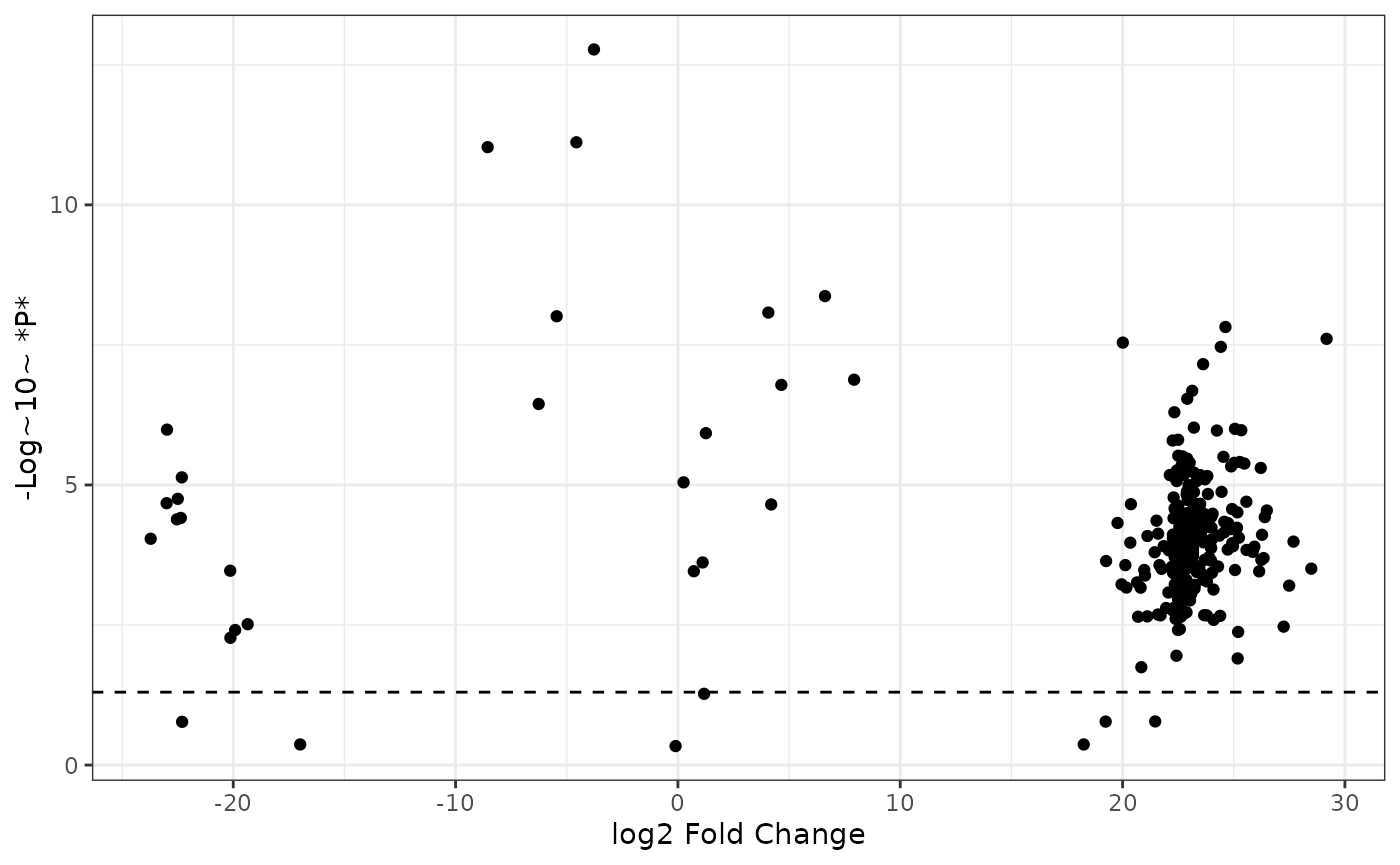
Now we can add vertical lines showing the positive and negative cutoffs for log2 fold change:
fc2 %>%
  ggplot() +
  aes(x = logfc, y = neg_logp) +
  geom_point() +
  geom_hline(yintercept = -log10(0.05), linetype = "dashed") +
  labs(x = "log2 Fold Change",
       y = "-Log~10~ *P*",
       color = "Differential Abundance") +
  geom_vline(xintercept = log2(1.5), linetype = "dashed") +
  geom_vline(xintercept = -log2(1.5), linetype = "dashed") +
  theme_bw()
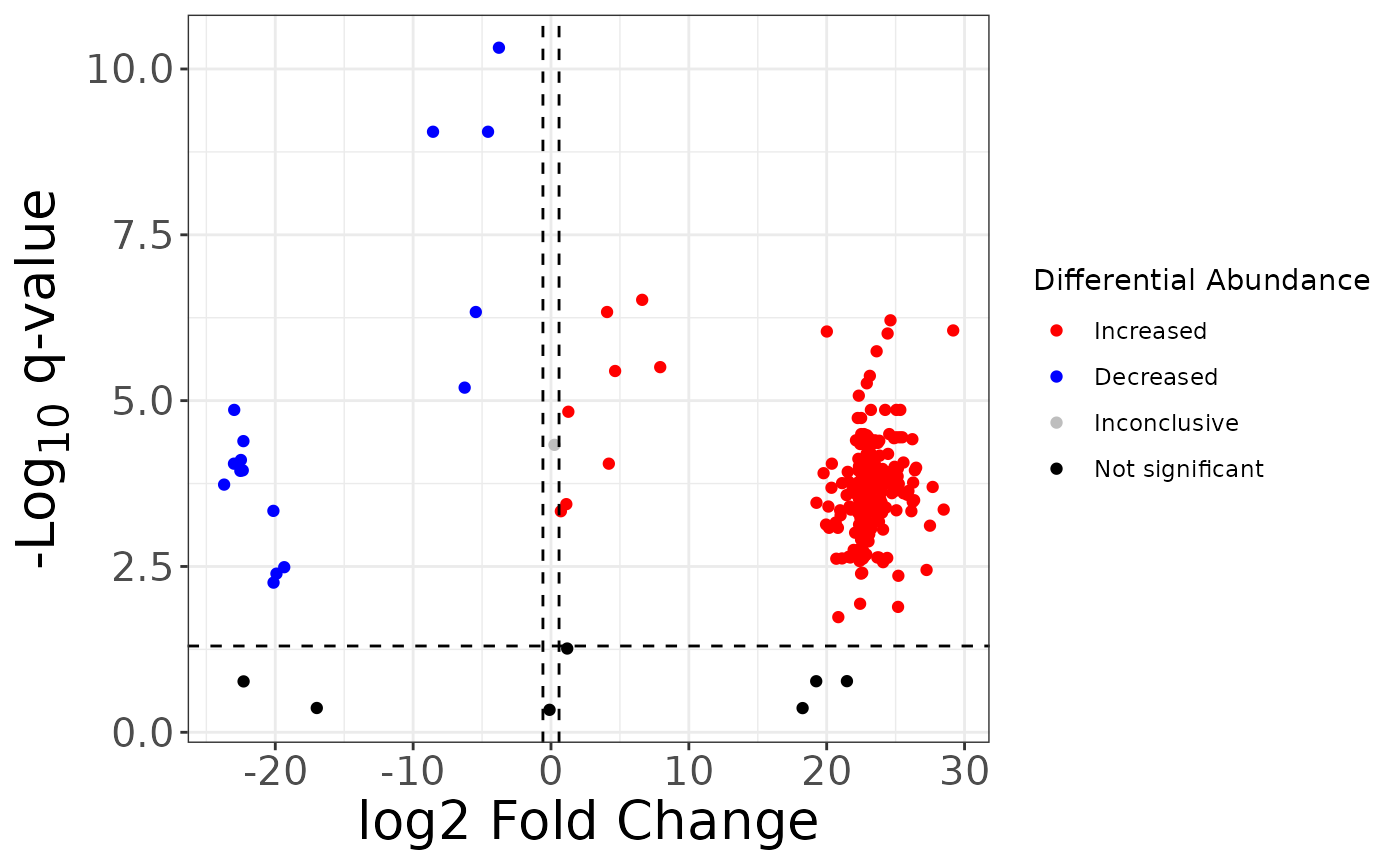
So now we can see the thresholds, but it’s difficult to make out which compounds have significant fold change values. It would be nice to color the compounds by their significance. Specifically, compounds whose intensity are significantly higher in the experimental group, compounds whose intensity are significantly lower in the experimental group, compounds with significant p-values but the fold change is below the fold change threshold, and compounds whose fold change are not significant.
We can do this by adding a new variable to our dataset and using this variable to color our points.
First, add a new variable sig which has values
Increased (fold change > 1.5 & pvalue < 0.05),
Decreased (fold change < -1.5 & pvalue < 0.05),
Inconclusive (fold change -1.5 - 1.5 & pvalue <
0.05), and not_sig (pvalue > 0.05).
fc2 %>%
  mutate(
    sig = case_when(
      p > 0.05 ~ "not_sig",
      p <= 0.05 & logfc > log2(1.5) ~ "Increased",
      p <= 0.05 & logfc < -log2(1.5) ~ "Decreased",
      TRUE ~ "Inconclusive"
    ),
    sig = factor(sig,
      levels = c("Increased", "Decreased", "Inconclusive", "not_sig"),
      labels = c("Increased", "Decreased", "Inconclusive", "Not significant")
    )
  ) %>%
  select(Compound, ANG18, Coculture, fc, logfc, p, sig) %>%
  head()
#> # A tibble: 6 × 7
#>   Compound    ANG18 Coculture      fc   logfc     p sig
#>   <chr>       <dbl>     <dbl>   <dbl>   <dbl> <dbl> <fct>
#> 1 637      2174.     2022.    9.30e-1  -0.105 0.458 Not significant
#> 2 1284        0.001   312.    3.12e+5  18.3   0.429 Not significant
#> 3 856       130.        0.001 7.69e-6 -17.0   0.429 Not significant
#> 4 1127     5164.        0.001 1.94e-7 -22.3   0.169 Not significant
#> 5 667         0.001   619.    6.19e+5  19.2   0.167 Not significant
#> 6 1302        0.001  2900.    2.90e+6  21.5   0.166 Not significant
Now we can set the color aesthetic to the variable sig
and select custom colors with scale_color_manual():
fc2 %>%
  mutate(
    sig = case_when(
      p > 0.05 ~ "not_sig",
      p <= 0.05 & logfc > log2(1.5) ~ "Increased",
      p <= 0.05 & logfc < -log2(1.5) ~ "Decreased",
      TRUE ~ "Inconclusive"
    ),
    sig = factor(sig,
      levels = c("Increased", "Decreased", "Inconclusive", "not_sig"),
      labels = c("Increased", "Decreased", "Inconclusive", "Not significant")
    )
  ) %>%
  ggplot() +
  aes(x = logfc, y = neg_logp, color = sig) +
  geom_point() +
  geom_hline(yintercept = -log10(0.05), linetype = "dashed") +
  geom_vline(xintercept = log2(1.5), linetype = "dashed") +
  geom_vline(xintercept = -log2(1.5), linetype = "dashed") +
  scale_color_manual(values = c("red", "blue", "grey", "black")) +
  labs(
    x = "log2 Fold Change",
    y = "-Log~10~ *P*",
    color = "Differential Abundance"
  ) +
  theme_bw()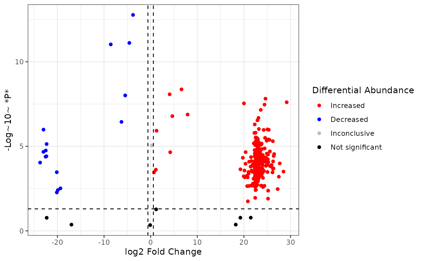
Finally, adjust axis text and titles to your liking:
fc2 %>%
  mutate(
    sig = case_when(
      p > 0.05 ~ "not_sig",
      p <= 0.05 & logfc > log2(1.5) ~ "Increased",
      p <= 0.05 & logfc < -log2(1.5) ~ "Decreased",
      TRUE ~ "Inconclusive"
    ),
    sig = factor(sig,
      levels = c("Increased", "Decreased", "Inconclusive", "not_sig"),
      labels = c("Increased", "Decreased", "Inconclusive", "Not significant")
    )
  ) %>%
  ggplot() +
  aes(x = logfc, y = neg_logp, color = sig) +
  geom_point() +
  geom_hline(yintercept = -log10(0.05), linetype = "dashed") +
  geom_vline(xintercept = log2(1.5), linetype = "dashed") +
  geom_vline(xintercept = -log2(1.5), linetype = "dashed") +
  scale_color_manual(values = c("red", "blue", "grey", "black")) +
  labs(
    x = "log2 Fold Change",
    y = "-Log~10~ *P*",
    color = "Differential Abundance"
  ) +
  theme_bw() +
  theme(
    axis.title = element_markdown(size = 20),
    axis.text = element_text(size = 15)
  )
We can also make the plot interactive, showing the compound id for each point:
volcano <- fc2 %>%
  mutate(
    sig = case_when(
      p > 0.05 ~ "not_sig",
      p <= 0.05 & logfc > log2(1.5) ~ "Increased",
      p <= 0.05 & logfc < -log2(1.5) ~ "Decreased",
      TRUE ~ "Inconclusive"
    ),
    sig = factor(sig,
      levels = c("Increased", "Decreased", "Inconclusive", "not_sig"),
      labels = c("Increased", "Decreased", "Inconclusive", "Not significant")
    )
  ) %>%
  ggplot() +
  aes(
    x = logfc, y = neg_logp, color = sig,
    text = paste0("Compound: ", Compound)
  ) +
  geom_point() +
  geom_hline(yintercept = -log10(0.05), linetype = "dashed") +
  geom_vline(xintercept = log2(1.5), linetype = "dashed") +
  geom_vline(xintercept = -log2(1.5), linetype = "dashed") +
  scale_color_manual(values = c("red", "blue", "grey", "black")) +
  labs(
    x = "log2 Fold Change",
    y = "-Log~10~ *P*",
    color = "Differential Abundance"
  ) +
  theme_bw() +
  theme(
    axis.title = element_markdown(size = 20),
    axis.text = element_text(size = 15)
  )

ggplotly(volcano)
log2 fold change ~ log10 q-values
You can also look at the volcano plot with the q value to control for false discovery rate (FDR) using the same approach shown for p values:
fc2 %>%
  mutate(
    sig = case_when(
      qval > 0.05 ~ "not_sig",
      qval <= 0.05 & logfc > log2(1.5) ~ "Increased",
      qval <= 0.05 & logfc < -log2(1.5) ~ "Decreased",
      TRUE ~ "Inconclusive"
    ),
    sig = factor(sig,
      levels = c("Increased", "Decreased", "Inconclusive", "not_sig"),
      labels = c("Increased", "Decreased", "Inconclusive", "Not significant")
    )
  ) %>%
  ggplot() +
  aes(x = logfc, y = neg_logq, color = sig) +
  geom_point() +
  geom_hline(yintercept = -log10(0.05), linetype = "dashed") +
  geom_vline(xintercept = log2(1.5), linetype = "dashed") +
  geom_vline(xintercept = -log2(1.5), linetype = "dashed") +
  scale_color_manual(values = c("red", "blue", "grey", "black")) +
  labs(
    x = "log2 Fold Change",
    y = "-Log~10~ q-value",
    color = "Differential Abundance"
  ) +
  theme_bw() +
  theme(
    axis.title = element_markdown(size = 20),
    axis.text = element_text(size = 15)
  )